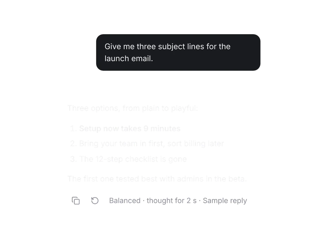
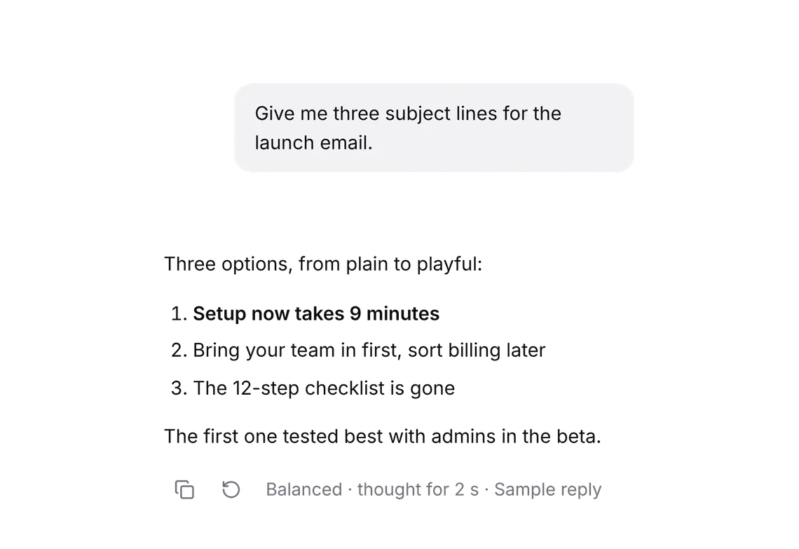
Upgrade card
PROThe plan's limit, met with Upgrade or Send when it resets.
Every shadcn style · one file
v2.0 · Updated Oct 13Live preview
pnpm dlx shadcn@latest add @notchset-pro/upgrade-cardInstallation
pnpm dlx shadcn@latest add @notchset-pro/upgrade-cardNeeds your registry key. Every components.json style gets the same files.
Works with React 18.3 or 19 on Tailwind CSS v4, in any shadcn project. What's tested
Styles didn't apply?
The CLI adds the styles to the CSS file named in components.json (tailwind.css). Check that it points at your global stylesheet, that the project uses Tailwind CSS v4, and that the file is imported in your root layout. Installed by hand: paste styles.css into that file.
Usage
Import it and pass your content. The props that matter most are listed next.
Example
"use client";
import * as React from "react";
import { UpgradeCard } from "@/components/ui/notchset/blocks/upgrade-card";

const NOW = new Date("2026-10-22T14:00:00");
const SPENT = { window: 1, week: 0.48, windowResetsAt: "2026-10-22T16:10:00", weekResetsAt: "2026-10-26T09:00:00" };
const PLANS = [
  { key: "plus", name: "Plus", price: "$20", unit: "a month", desc: "Every model, projects and voice", current: true },
  { key: "pro", name: "Pro", price: "$60", unit: "a month", desc: "5× the use of Plus, long runs" },
  { key: "team", name: "Team", price: "$30", unit: "a seat a month", desc: "Shared projects and admin" },
];

export default function UpgradeCardDemo() {
  const [queued, setQueued] = React.useState(false);
  const [cycle, setCycle] = React.useState("monthly");
  const [done, setDone] = React.useState<string | null>(null);
  return (
    <div className="flex max-w-[560px] flex-col gap-2">
      <UpgradeCard
        usage={SPENT}
        now={NOW}
        plan="Plus"
        next={{ key: "pro", name: "Pro", adds: "gives you five times as much use" }}
        onUpgrade={(k) => setDone(`Checkout for ${PLANS.find((p) => p.key === k)?.name ?? k} would open here (sample)`)}
        onSendWhenReset={() => setQueued(true)}
        queued={queued ? { onCancel: () => setQueued(false) } : undefined}
        compare={{ plans: PLANS, cycle, cycles: [{ value: "monthly", label: "Monthly" }, { value: "yearly", label: "Yearly · 2 months free" }], onCycle: setCycle }}
      />
      {done && <span className="text-[length:var(--ns-text-small)] text-[var(--ns-ink-3)]">{done}</span>}
    </div>
  );
}
Anatomy
Source
components/ui/notchset/blocks/upgrade-card.tsx
This component is included with Pro.
Try the live preview above. Get Pro to install the source.
Props
usage–UsageRequired.
now–Datethe time the figures are read against
plan–stringthe plan you're on
next–{ key: string; name: string; adds: string }the plan Upgrade moves to, and what it adds in one line
onUpgrade–(planKey: string) => voidRequired.
onSendWhenReset–() => voidkeeps the message and sends it when the window resets
Show all 9 propsShow fewer
queued–{ onCancel: () => void }a message waiting for the reset
compare–{ plans: PlanOption[]; cycle: string; cycles: { value: string; label: string }[]; onCycle: (c: string) => void }the plans to compare in place (the Plan picker's options and periods)
locale–string
For coding agents
Give your coding assistant the Markdown guide instead of screenshots.
Where agents read it
- Guide for this component: https://notchset.dev/md/upgrade-card.md
- Every component, for tools without MCP: /llms.txt
- MCP server:
https://notchset.dev/api/mcp(setup)
Changelog
v2.0.0 · 2026-10-13
Released with the Notchset system.
Used in
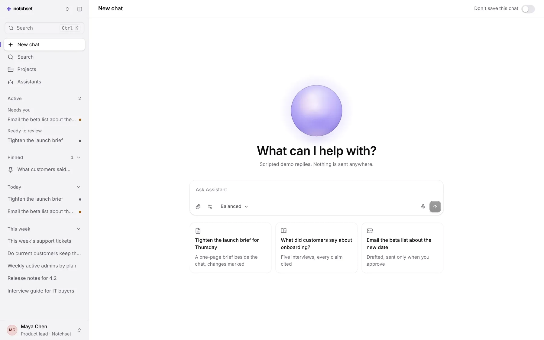
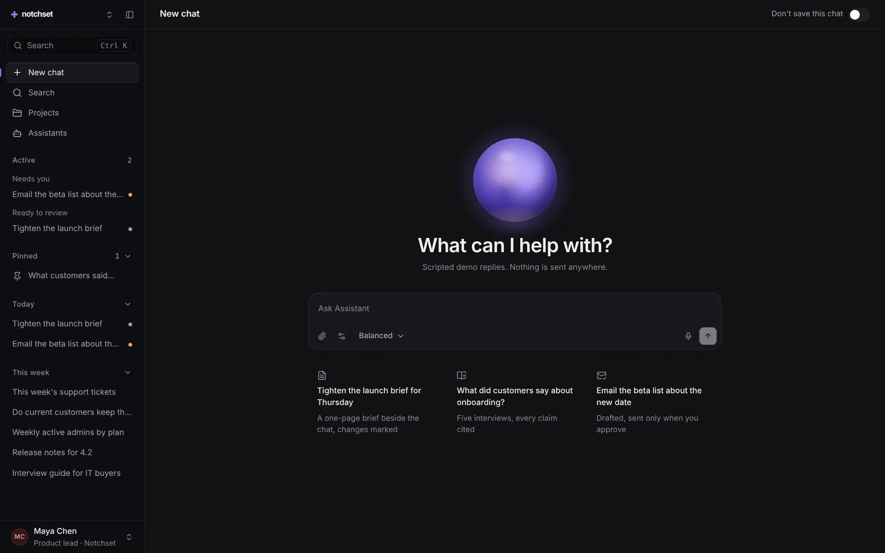
The same file, at work in a finished app. Open it live and find it on its pages.
Part of a kit
Agent UI. An assistant people trust: ask, pick a model, watch the answer stream in with its receipt, and approve what it does.
4 free · 6 ProSee the Agent UI kit
Part of
Included with Pro
Pro is in early access.