Button
Freev1.0.0The shadcn Button with loading and done states built in, so the label never jumps.
Build for your project
Code/install build
Usage
Import it and pass your content. The props that matter most are listed next.
Example
"use client";

import { Button, buttonVariants } from "@/components/ui/notchset/button";

export function EvalActions({ runEval, deploy }: { runEval: () => Promise<void>; deploy: () => void }) {
  return (
    <div className="flex flex-wrap items-center gap-3">
      {/* Async onClick: the button shows its loading and success states on its own. */}
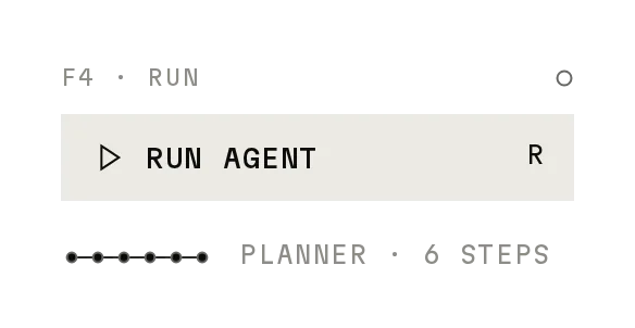
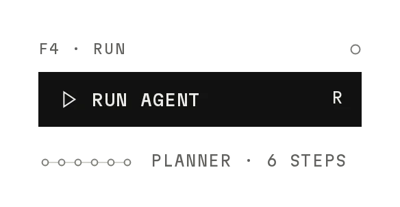
      <Button icon="play" kbd="⌘↵" loadingLabel="Running" successLabel="Done" onClick={runEval}>
        Run eval
      </Button>
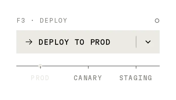
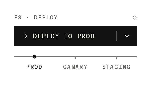
      <Button variant="plate" icon="arrow" onClick={deploy}>
        Deploy
      </Button>
      <a className={buttonVariants({ variant: "link" })} href="/docs">
        Docs
      </a>
    </div>
  );
}
Props
variant–"default" | "destructive" | "outline" | "secondary" | "ghost" | "link" | "plate" | "signal"shadcn's six, plus Plate (a key that rests on a 1px plate and presses onto it) and Signal (outlined in signal, for destructive actions).
size–"default" | "xs" | "sm" | "lg" | "icon" | "icon-xs" | "icon-sm" | "icon-lg"32 / 24 / 28 / 36px tall, as shadcn, with 12px mono labels (13px on lg); icon sizes are squares. At least 44px tall on touch screens.
icon–"play" | "arrow" | "plus" | "trace" | "stop" | "copy" | "external" | ReactNodeA Notchset glyph or your own svg; the scanner and check take its place.
iconPosition–"left" | "right"Default left.
kbd–stringA shortcut hint in a box; sets aria-keyshortcuts.
loading / success–booleanControlled states.
Show all 18 propsShow fewer
loadingLabel / successLabel–stringThe words while working and when done; the widest label sets the width.
successHold–numberHow long an automatic success shows (ms). Default 1400.
flat–booleanNo hover ruler, and no plate on Plate.
onClick–(event) => unknownReturn a Promise and the button runs itself.
confirm–stringTwo steps: the first press arms it with this label in signal; the second runs onClick. Disarms after 3s or on Esc.
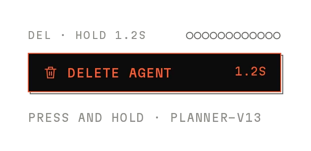
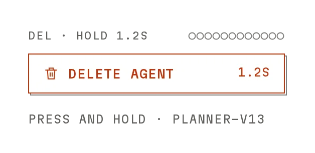
hold / onHoldComplete–number / () => voidPress and hold (ms): the key sinks onto its plate while a fill grows, then runs onHoldComplete. Release early and nothing happens.
undoMs / onUndo–number / () => voidAfter a hold, the key reads UNDO · 5S and counts down; pressing it calls onUndo. Default 5000; 0 for none.
pressed–booleanA toggle: filled with ink while true (aria-pressed).
count–numberA number after the label that rolls when it changes.
progress–number0–1: a fill grows inside the key and a rolling percentage follows the label.
disabledReason–stringDisabled with a reason: stays focusable, shows why in a tag above it on hover and focus, ignores presses.
render (Base UI) / asChild (Radix)–as shadcnRender as a link or your own element.
Anatomy
- Same exports, variants, sizes and data-slot as shadcn's Button, plus Plate.
- Base UI and Radix builds: your components.json picks one.
- The Notchset instrument parts: scanner, check; cues through beautiful-ui-sound.
Buttondata-slot="button"The button.
Icondata-slot="button-icon"The icon, scanner or check.
Rulerdata-slot="button-ruler"The hover ruler.
Source
components/ui/notchset/button.tsx
Loading the code
Build for your project
Code/install build
Installation
Base UI
pnpm dlx shadcn@latest add https://notchset.dev/r/button.jsonRadix
pnpm dlx shadcn@latest add https://notchset.dev/r/radix-nova/button.jsonFree, no account or key. Use the command for your project's primitives: a radix-*, new-york or default style in components.json is Radix, a base-* style is Base UI. With the @notchset registry added, @notchset/<name> picks for you.
Install by hand
- 1. Add the packages
pnpm add @base-ui/react@^1 class-variance-authority@^0.7 - 2. Copy the files to these paths (the source, or save them all as a .zip)
- components/ui/notchset/button.tsx
- components/ui/notchset/button-client.tsx
- lib/beautiful-ui/notchset/button-variants.ts
- lib/beautiful-ui/notchset/button.tsx
- lib/beautiful-ui/notchset/instrument.tsx
- lib/beautiful-ui/notchset/root.ts
- 3. No stylesheet needed.
- 4. Install what it builds on first: shadcn's cn helper (lib/utils.ts, from npx shadcn init), the theme foundation (its tokens and base styles)
Styles didn't apply?
The CLI adds the styles to the CSS file named in components.json (tailwind.css). Check that it points at your global stylesheet, that the project uses Tailwind CSS v4, and that the file is imported in your root layout. Installed by hand: paste styles.css into that file.
For coding agents
Give your coding assistant the Markdown guide instead of screenshots.
Use it for
- Every action in a Notchset interface
- A drop-in for shadcn's Button: same exports, variants, sizes and data-slot
- Async work: return a Promise from onClick and it runs loading → done → idle
Use something else when
- Starting and stopping a run: use Run Button
- Destroying something that matters: use Confirm Button
Mistakes to avoid
- Use one destructive (signal) button per view, for stop and destroy
- Install the Notchset theme for the exact look; without it the button uses your shadcn tokens
Agents find it by
- button, action, run, deploy, async button, loading button, shadcn button, link button, Notchset
Where agents read it
- Guide for this component: https://notchset.dev/md/button.md
- Every component, for tools without MCP: /llms.txt
- MCP server:
https://notchset.dev/api/mcp(setup)
Behaviour
Keyboard
- Enter / Space
- Activate
Accessibility
- A native button through Base UI or Radix, as shadcn builds it
- aria-busy while loading; only the current label is read (the others are hidden)
- kbd sets aria-keyshortcuts (⌘ also as Ctrl)
- Focus shows crop marks, keyboard only
Motion
- Hover
- The fill changes and a 4px tick ruler fades in (not on touch, flat or link)
- Press
- Plate: the key travels 2px onto its plate in 40ms and springs back in 200ms
- Loading
- The scanner: five ticks fading in turn, 700ms
- Done
- The check traces in over 260ms; it holds 1400ms, then idle
- Link
- Ink draws across the rule from the left in 280ms (retracting to the right); the arrow steps 4px
Responsive
- Fixed heights per size (24, 28, 32, 36px), labels 12–13px; icon sizes are squares.
- On touch screens every size grows to at least 44px tall.
Performance
- One native button; press, hover and the link rule are CSS transitions on transform, background and scale.
- The scanner and check draw only while loading or done; an idle button runs no JavaScript.
- Motion off (reduced motion or data-motion="off") lands every transition at once.
Changelog
v1.0.0 · 2026-10-02
First release