Task detail
PROA task, written in: the drawer's and the page's body.
Every shadcn style · one file
v2.1 · Updated Oct 21Live preview
pnpm dlx shadcn@latest add @notchset-pro/task-detailInstallation
pnpm dlx shadcn@latest add @notchset-pro/task-detailNeeds your registry key. Every components.json style gets the same files.
Works with React 18.3 or 19 on Tailwind CSS v4, in any shadcn project. What's tested
Styles didn't apply?
The CLI adds the styles to the CSS file named in components.json (tailwind.css). Check that it points at your global stylesheet, that the project uses Tailwind CSS v4, and that the file is imported in your root layout. Installed by hand: paste styles.css into that file.
Usage
Import it and pass your content. The props that matter most are listed next.
Example
"use client";
import * as React from "react";
import { CalendarDays, Tag } from "lucide-react";
import { PriorityMark } from "@/components/ui/notchset/priority-mark";
import { PropertyPill } from "@/components/ui/notchset/property-pill";
import { StatusGlyph } from "@/components/ui/notchset/status-glyph";
import { ReplyComposer } from "@/components/ui/notchset/blocks/reply-composer";
import { TaskDetail } from "@/components/ui/notchset/blocks/task-detail";

const PEOPLE = [
  { id: "hana", name: "Hana Moriyama", hint: "QA engineer" },
  { id: "tomas", name: "Tomás Ferreira", hint: "Backend engineer" },
];

export default function TaskDetailDemo() {
  const [title, setTitle] = React.useState("Recalculate ETA when a job runs long");
  const [desc, setDesc] = React.useState("When a job runs past its estimate, every later stop's ETA should move.");
  const [subs, setSubs] = React.useState([
    { title: "Listen for job-overrun events", done: true },
    { title: "Send the 'running late' text once per stop", done: false },
  ]);
  const [more, setMore] = React.useState(false);
  const [late, setLate] = React.useState(true);
  const [tab, setTab] = React.useState("comments");
  const [draft, setDraft] = React.useState("");
  const [thread, setThread] = React.useState(["Tested with a 40-stop route: ETAs move."]);
  return (
    <div className="w-full max-w-[600px]">
      <TaskDetail
        title={title}
        onTitleChange={(t) => (t ? setTitle(t) : undefined)}
        banner={late ? { tone: "bad", icon: <CalendarDays />, title: "Overdue", detail: "by 1 day", action: { label: "Move to tomorrow", onClick: () => setLate(false) } } : undefined}
        properties={
          <>
            <PropertyPill kind="Status" icon={<StatusGlyph status="review" label={title} />}>In review</PropertyPill>
            <PropertyPill kind="Due" tone={late ? "bad" : undefined} icon={<CalendarDays />}>{late ? "Yesterday" : "Tomorrow"}</PropertyPill>
            <PropertyPill kind="Priority" icon={<PriorityMark priority={3} />}>High</PropertyPill>
            <PropertyPill kind="Labels" icon={<Tag />}>Backend</PropertyPill>
          </>
        }
        details={{ open: more, onToggle: () => setMore(!more), items: [{ label: "Project", value: "Route planner v2" }, { label: "Started", value: "Wed, Oct 14" }] }}
        description={desc}
        onDescriptionChange={setDesc}
        checklist={{ items: subs, onToggle: (i) => setSubs((s) => s.map((x, k) => (k === i ? { ...x, done: !x.done } : x))) }}
        thread={{
          tabs: [{ value: "comments", label: "Comments", count: thread.length }, { value: "activity", label: "Activity" }],
          value: tab,
          onChange: setTab,
          body: tab === "comments" ? <ul className="m-0 flex list-none flex-col gap-2 p-0">{thread.map((c, i) => <li key={i}>{c}</li>)}</ul> : <p className="m-0 text-[var(--ns-ink-3)]">Hana sent it for review yesterday.</p>,
          composer: (
            <ReplyComposer
              mode="comment"
              mentions={PEOPLE}
              value={draft}
              onValueChange={setDraft}
              onSend={() => {
                setThread((t) => [...t, draft]);
                setDraft("");
              }}
              onDiscard={() => setDraft("")}
              placeholder="Leave a comment… @ to mention"
              canSend={!!draft.trim()}
            />
          ),
        }}
      />
    </div>
  );
}
This example also uses Priority mark, Property pill, Reply composer, Status glyph. This command installs them with it, so the example pastes as it is:
pnpm dlx shadcn@latest add @notchset-pro/task-detail @notchset/priority-mark @notchset/property-pill @notchset-pro/reply-composer @notchset/status-glyphAnatomy
Source
components/ui/notchset/blocks/task-detail.tsx
This component is included with Pro.
Try the live preview above. Get Pro to install the source.
Props
title–stringRequired.
onTitleChange–(title: string) => boolean | voida refused save returns false and the words stay as typed
done–booleanstrikes the title
banner–{ tone: "neutral" | "warn" | "bad" | "ok"; icon?: React.ReactNode; title: React.ReactNode; detail?: React.ReactNode; action?: { label: string; onClick: () => void } | undefined }the one condition to act on, with its fix
properties–React.ReactNodethe property pills
details–{ items: { label: string; value: React.ReactNode }[]; open: boolean; onToggle: () => void }further facts, folded until asked for; the host keeps whether they're open
Show all 13 propsShow fewer
description–stringRequired.
onDescriptionChange–(text: string) => boolean | voidRequired.
descriptionPlaceholder"Add what someone picking this up needs to know."stringchecklist–{ items: { title: string; done: boolean }[]; onToggle: (index: number) => void }sections[]{ key: string; title: string; count?: number | undefined; body: React.ReactNode }[]further sections in order (what it waits on, its files), each with a title and an optional count
thread–{ tabs: { value: string; label: string; count?: number | undefined }[]; value: string; onChange: (v: string) => void; body: React.ReactNode; composer?: React.ReactNode }the conversation: its tabs (Comments, Activity), what the chosen one shows, and the composer under it
mode"panel""panel" | "page""page" sets the title larger and the column narrower, for a task opened on its own page
For coding agents
Give your coding assistant the Markdown guide instead of screenshots.
Where agents read it
- Guide for this component: https://notchset.dev/md/task-detail.md
- Every component, for tools without MCP: /llms.txt
- MCP server:
https://notchset.dev/api/mcp(setup)
Changelog
v2.1.0 · 2026-10-21
New: a task's full record: properties, subtasks, blockers, files, thread and history.
v2.0.0 · 2026-10-13
Released with the Notchset system.
Used in
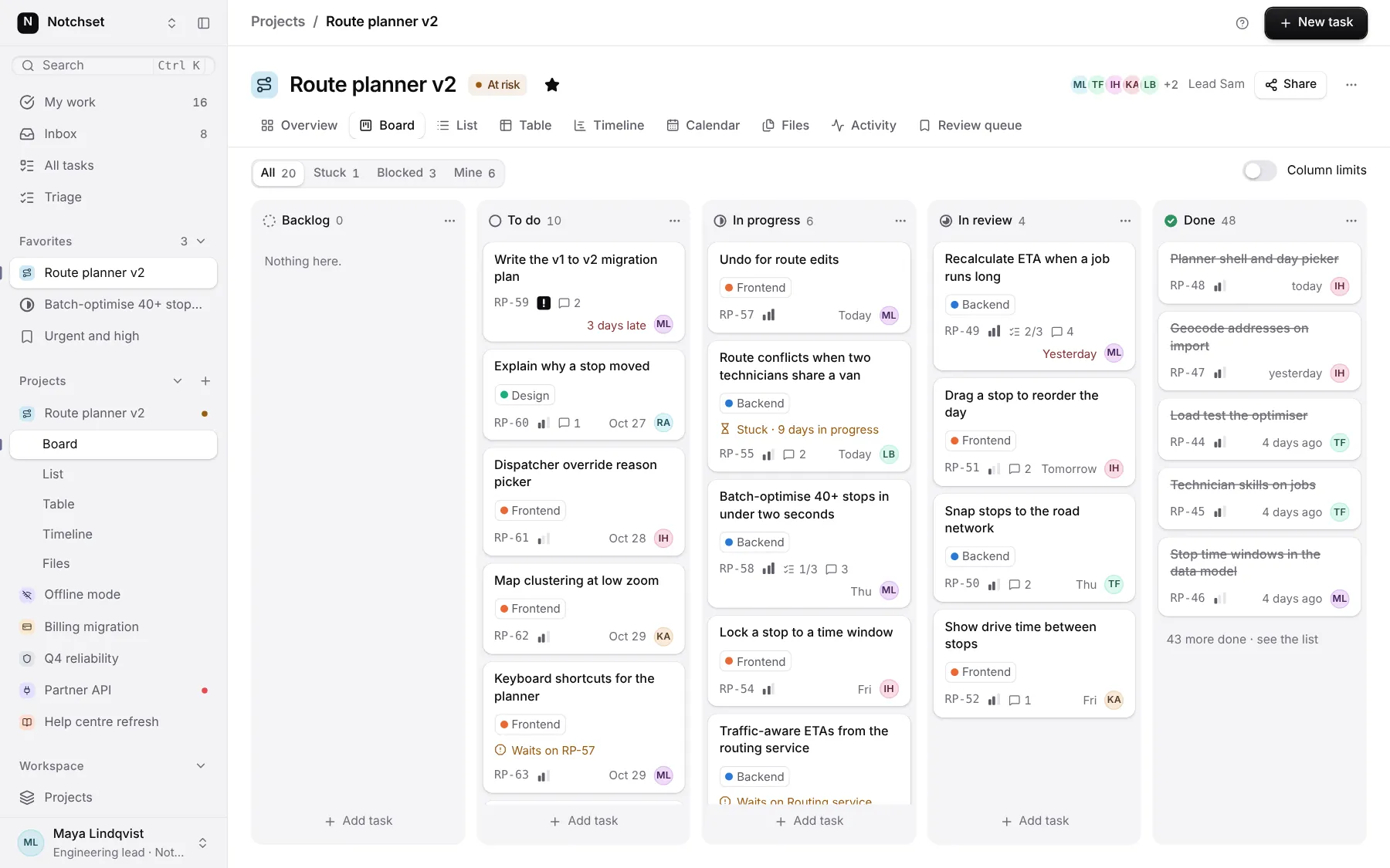
The same file, at work in a finished app. Open it live and find it on its pages.
Part of
Included with Pro
Pro is in early access.