Button Group
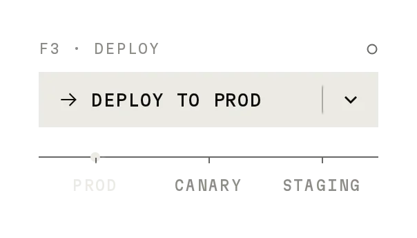
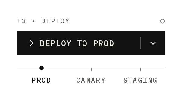
Freev1.0.0Related buttons in one frame with a shared hover, or a selector between options.
Build for your project
Code/install build
Usage
Import it and pass your content. The props that matter most are listed next.
Example
"use client";

import * as React from "react";
import { ButtonGroup } from "@/components/ui/notchset/button-group";

export function RangePicker() {
  const [range, setRange] = React.useState("7D");
  return (
    <ButtonGroup
      aria-label="Range"
      items={[
        { value: "24H", label: "24H" },
        { value: "7D", label: "7D" },
        { value: "30D", label: "30D" },
      ]}
      value={range}
      onValueChange={setRange}
    />
  );
}
Props
items–{ value, label }[]Makes it the selector. Without items it is shadcn's ButtonGroup.
value / defaultValue / onValueChange–string / (value) => voidThe selected item.
nodes–booleanThe nodes above the segments. Default true.
segment–numberSegment width in px. Default 56.
orientation–"horizontal" | "vertical"As shadcn; the selector stacks vertically too.
Anatomy
- Same exports as shadcn's Button Group.
- The selector mode adds the travelling block and nodes.
- Base UI and Radix builds (ButtonGroupText render / asChild), as shadcn.
ButtonGroupdata-slot="button-group"The frame (or the selector's radiogroup).
ButtonGroupSeparatordata-slot="button-group-separator"An ink divider.
ButtonGroupTextdata-slot="button-group-text"A text segment.
Source
components/ui/notchset/button-group.tsx
Loading the code
Build for your project
Code/install build
Installation
Base UI
pnpm dlx shadcn@latest add https://notchset.dev/r/button-group.jsonRadix
pnpm dlx shadcn@latest add https://notchset.dev/r/radix-nova/button-group.jsonFree, no account or key. Use the command for your project's primitives: a radix-*, new-york or default style in components.json is Radix, a base-* style is Base UI. With the @notchset registry added, @notchset/<name> picks for you.
Install by hand
- 1. Add the packages
pnpm add @base-ui/react@^1 class-variance-authority@^0.7 - 2. Copy the files to these paths (the source, or save them all as a .zip)
- components/ui/notchset/button-group.tsx
- lib/beautiful-ui/notchset/button-group.tsx
- lib/beautiful-ui/notchset/instrument.tsx
- lib/beautiful-ui/notchset/root.ts
- 3. No stylesheet needed.
- 4. Install what it builds on first: shadcn's cn helper (lib/utils.ts, from npx shadcn init), the theme foundation (its tokens and base styles)
Styles didn't apply?
The CLI adds the styles to the CSS file named in components.json (tailwind.css). Check that it points at your global stylesheet, that the project uses Tailwind CSS v4, and that the file is imported in your root layout. Installed by hand: paste styles.css into that file.
For coding agents
Give your coding assistant the Markdown guide instead of screenshots.
Use it for
- Picking one of a few ranges or modes
- Joining related buttons, as shadcn's Button Group
Use something else when
- More than five or six choices: use a Select
Mistakes to avoid
- Give the selector an aria-label
Agents find it by
- button group, segmented control, range picker, time range, single select, toolbar group, Notchset
Where agents read it
- Guide for this component: https://notchset.dev/md/button-group.md
- Every component, for tools without MCP: /llms.txt
- MCP server:
https://notchset.dev/api/mcp(setup)
Behaviour
Keyboard
- ← → / ↑ ↓
- Move the choice
- Home / End
- First or last
Accessibility
- The selector is a radiogroup with roving tabindex; children mode is role=group as shadcn
- Selection reads from the ink block and the node, not colour alone
Motion
- Choose
- The ink block travels in 340ms cubic-bezier(.34,1.25,.5,1); the label colour switches after 110ms; the node lights 200ms after
Responsive
- Segments share the width evenly; long labels truncate.
- 44px segments on touch screens.
Performance
- The selector thumb is one element moved with a transform; the count flips text only when it changes.
Changelog
v1.0.0 · 2026-10-02
First release